Hey, everyone! After a little change of posting policy, we're back with all of the Daredevil submissions we received over the course of the month! I've had some questions as to why we switched things up. The story is, I applied to graduate school this month. So while I got all my stuff together, I thought it might be best to make it easier on myself by posting everything at the same time. For now, this is not a permanent policy, and we'll be back to normal next month, posting several submissions at a time throughout the month. That said, let's check out what we picked up!
"For my version of Daredevil I obviously wanted to play up the devil aspect of his name (all the better to terrify criminals). I also wanted to make the mask reflect his blindness. Finally I gave his feet a cloven hoof look because it seems like he could have better balance and it would give him a bit of grip when he scrambles up walls (like a mountain goat)."
"For my Daredevil design I first asked myself who Daredevil is. I came up with the idea that he is a blind guy who does fancy parkour and beats the crap out of street thugs. I tried to reflect these thoughts in the design. Streamlined, red, with crimson accents. A single yellow "D" because 2 "D's" looked too crowded and abstract. A hood that is reminiscent of a boxer's robe hood, just like Matt Murdock's father would have worn. His billy clubs are attacked to a small pack on his back, making it more balanced for him when hes jumping rooftops. And finally his eyes are covered by a blindfold to enhance that idea of blind justice to the crooks he beats down."
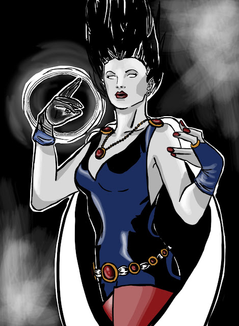
"Judge Murdock is in pain every minute of the day he spends at the courthouse due to his hyper senses. Everybody knows he suffers severe color blindness, he is albino and people think that is the reason of his bad temper. When he is not working, he is Daredevil. He wears a tech-helmet that allows him to control his sense. He is a mild manered crime fighter. Every body knows he is a blind superhero because he makes no use of his vision. I made this drawilng listening a song called 'titanium' so I put Titanium on DD face. And I think the city of NY is part of the comic so I made an effor to put Kingpin office ont the background."
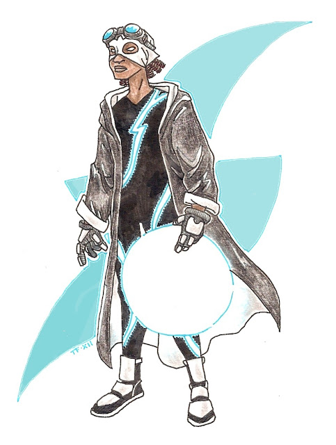
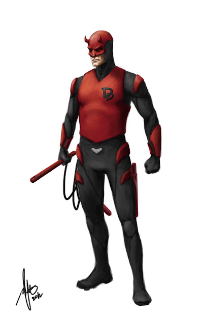
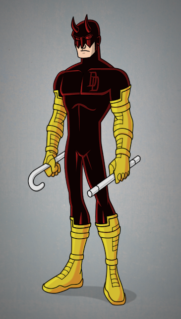
"I chose to give him a short sleeve form fitting bodysuit that exposes his arm more with some padding on his upper arm. I also gave him short padded gloves given his background in boxing and the need to protect one's knuckle when he's just a normal human being using his fists as a primary weapon. The boots are made with soft materials for maximum mobility range with shock absorbing padding lining the sole and the bottom given how much rooftop strolling and acrobatic he does. Red vest over the body suit with some more padding exposed and underneath, without the popped collar he just look like a gymnast. I also redesigned the logo with a stylized upper case and lower case D to make a tiny devilish shape that looks the similar upside down. I really liked the yellow in the original color scheme, the modern iteration seem too monotonous for me, so I incorporate it as much as I can, including the the logo
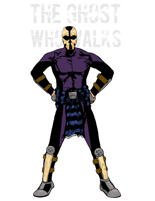
"The mask/cowl completely covers his upper face, leaving the ears, nose and mouth expose, Dark patch over the eye area because with out it his face looked unfinished. The horns are more protruding because it also serve as high frequency ultrasound emitter that Daredevil uses to echolocate."
![]() |
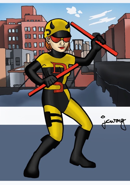
| J. Chris Wong |
"
I was trying to make the original costume even more '60's mod-influenced. Plus, I made the character female."
"The inspiration for the design was a simple concept: 'Hipster Daredevil'. But it ended up turning into a fairly sensible, modern, DIY style street level outfit."
"I've read that Daredevil's original yellow costume was made from Jack Murdock's old boxing gear... this is sort of a modern riff on that idea, with almost every part of the costume based on boxing or gym clothes. Though it's primarily informed by Matt's father, there's also some allusion to the Frank Miller ninja stuff with the oni print on the sweatshirt and the use of a Stick-style bo staff instead of the billy club. It fits a contemporary retelling of his origin, or yet another
Born Again-style story where Matt is stripped of his resources & is forced to start over from the ground up."
"The wraps on my Daredevil's hands reflect the wraps found in boxing and other hand-to-hand combat martial arts (as well as gymnastics). Both his arm wraps and blindfold are made from his father's boxing robe. The emblem on his chest is the letter 'D' in braille, and the braille at the top of the image spells out 'Daredevil.'
"I've always loved the idea of a superhero like Daredevil whose strengths are derived from a perceived weakness. My redesign embraces Daredevil's identity as visually impaired, and if my version of Daredevil had his own comic, you bet each page would have braille on it, and each cover would be embossed (the text and the image)."
![]() |
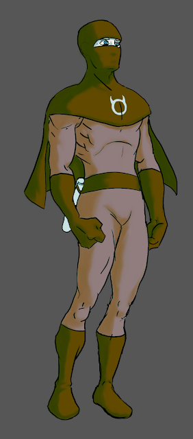
| Shang Protum |
"Matt Murdock's eyes are usually covered with dark glasses, so I feel it would only be appropriate that's the only part you can see of his alter-ego. Also, I've always thought that keeping the eyes or mouth visible increases the superhero's honesty-appeal. I would have given him some kind of a helmet (all rooftop acrobats should have one!) but it seems like it'd take away from the 'Man With No Fear' tag. The short cape recalls the jacket/cape worn by motorcycle daredevils. It should look good while the hero is in mid air, and keep out of his way while he's doing complicated acrobatics. The existing DD is hard to compete against, so I thought of a horned circle as an alternate logo."
![]() |
| Yifan Jiang |
"I wanted a straightforward clean design, I wanted to visit all DD's costumes (yes, even the armor) and mix them up.This suit is more stealthy, more functional. Simple blocks of colors are used to make it look old school while details suggest it's modern."
![]() |
| Cantas Karatas |
"Some stuff about Daredevil confused me, like why he has a sonar power like bats after his accident. He should really a blind guy, and maybe Tony Stark and he are friends. Tony gives him this suit with nano technology that he can see with."
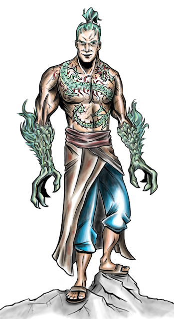
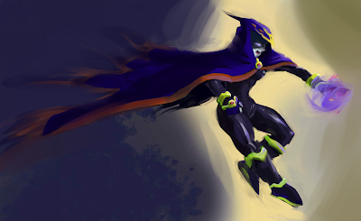
"My Daredevil design takes inspiration from both Japanese oni and from samurai armor, taking into account Matt Murdock's training in martial arts by Stick and The Chaste, his and The Chaste's prior interactions with the ninja order The Hand, and the 'devil' part of his motif (hence the Japanese oni inspiration). He wields two hanbo, which can join together into a traditional bo staff. Lastly, his ears are exposed to take advantage of his enhanced sense of hearing, and the palms and fingers of his gloves (as well as the soles of his shoes are made of an electroconductive fabric that allows him to accurately use his enhanced sense of touch. I did include the eyes on his costume, since most of his enemies don't know that he's blind."
"Bright red was waaaaay to easy to spot in even the dark, so I'm keeping it simple matte dark red and black."
![]() |
| Connor |
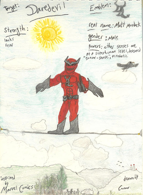
"I wanted to give him a different look and put it in a different setting, I was inspired by a
daredevil crossing Niagara Falls."
"I decided to remove the iconic DD symbol and horns, stripping the costume back before redesigning it. I've darkened the base red -- thought he would be a bit scarier without the bright superhero red. I've given him fingerless gloves so that when 'reading' things with his fingers it makes a bit more sense practically and removed the eyeholes (since he is blind and doesn't actually need them) making him a bit more disconcerting to criminals he encounters. I've also added abstract devil/hornhead piping - which is more visible at night (see below).
![]() |
| Thomas Crielly's "Nighttime Version" |
"It's the same costume just showing how it would appear in the dark rather than daylight."
"Daredevil's red costume has always been one of my favorite superhero costume designs. The simple minimalist design, monochrome colour scheme and logo are just perfect and are difficult to improve on. I wanted to keep my redesign simple and retain the red colour scheme. I subtly changed his mask to make it look a little more aggressive. I added the yellow portions to the costume as added protection and as a nod to his original costume."
"I focused on making his costume more realistic. Since his upgrade to the red suit I haven't seen any major changes in his wardrobe, I always disliked tights on heroes so I tried to militarize him and make his costume seem more armored."
"I pictured his costume a much more makeshift, ragtag ensemble with odd bits and pieces sewn together and tears from fights he's previously had. This makes sense since he's blind and might not be able to make and repair his costume precisely, but also instill a kind of craziness into his Daredevil persona. Instead of the regular mask, he wears black over mask to shield his whole face and a custom devil mask. I like to imagine he sculpts these 3D masks himself and has a varied collection depending on his mood. I also made his truncheon more of a demon claw. I wanted a more demon personal that would instill fear into criminals, as Daredevil has always been more extreme to me."
![]() |
| Dimitrios Kasdaglis |
"A blind-folded demon. A Dare-devil!"
![]() |
| Anthony Farrar |
"I wanted something that was more fierce to look at. I wanted a more imposing figure. The horns are forged of vibranium, allowing DD to absorb ambient sound so that he doesn't suffer from sensory overload when fighting, say, Klaw. It also allows him to strike the horns to enhance his own sonar sense of echolocation. The masked face provides a buffer against olfactory or taste overload from gases. The costume itself is textured vibranium mesh Kevlar that reduces impact, strikes and energy attacks. The symbol on his chest is a dual representation of a back to back DD, and also a demon's head. I replaced the billy club with a trident that has an extendable chain, so that it may be used as a Manriki Gusari as well a grappling hook. The body of the trident is segmented and each segment contains something DD might need: caltrops, smoke bombs, throwing darts laced with a sleeping agents, etc. -- kind of like his own utility belt."
![]() |
| Thomas Branch |
"I went with a monk/ninja look."
And there you have it! What do you think? Let us know in the comments below which Daredevil is your favorite and why, and stay tuned for the contest winner, as well as the contest announcement for next month. (You can get a little preview and head start now by checking out the
calendar!)


.jpg)


.png)


