First and foremost, I'm sorry this is late! I said on
Twitter and
Facebook that this would be up by 9:00 PM MDT, but other things got the best of me and here we are a couple of hours later. In any case, there's a load of great stuff here, so check out the eighth and final batch of submissions for the
Superhero of the Month &
Batman-News.com Batman redesign contest!
"Bruce's design is angular and hardier looking. It reflects the sophistication, complexity, weath that he possess. His gauntlets not only act as shield and weapon but also as extra storage other than his utility belt.
Batman with a yellow Bat symbol is very iconic therefore decided to use it. Modified the Bat Symbol to streamline with his cowl. As a constant reminder, Bruce inscribed the design of the Sinestro Corps onto his Utility belt."
"Dick's design is base on simplicity. Being a acrobat he prefer to have more flexibility and mobility, therefore he uses a "skeleton" utility belt which only carries the bare minimium equipment and his trusty Eskrima sticks. Dick modified his Eskrima sticks that can powerup and discharge electric currents in time of need against more powerful enemies. Used the red color scheme rather than his Nighwing blue color scheme to differentiate that he is a different persona (Batman/Nightwing). This costume might actually be a bridge to Batman Beyond's costume."
"If one color sums up the the blood and fear associated with bats and the rage that fuels Batman's crusade, it's red. My goal with this design was to make the costume more graphic, more representational and more functional. The ears and fangs serve to make Batman more of a monster to his enemies, while the red serves both a graphic and functional purpose. The cape and mask's stark contrast in the black of night serve as a distraction. Combatants are unable to see what his arms and legs are doing beneath the cape. As Batman picks through his pockets (if any hero deserves Rob Liefeld's pocket treatment, it's Batman) his attackers see a flying, twisting red demon."
![]() |
| Alicia Zybert |
Editor's Note: Alicia didn't leave any particular thoughts on her redesign.![]() |
| Arlen Raitt's Bruce Wayne |
"I was going for something more rugged and 'just get the job done'. He has a much more gritty feel to him, both with style and with how he stands. I wanted a more understated bat symbol, so I played with a negative space approach -- the black on his chest, when combined with his cape and cowl create one giant bat symbol. With his cape, I decided to try a slightly more minimalist approach and segmented it into three parts and modeled it after the actual physiology of a bat."
Editor's Note: The second image will be on Facebook soon!
![]() |
| Arlen Raitt's Dick Grayson |
"With Dick I went for more of a sleek look. I don't feel that he would ever voluntarily use a cape; of all the Robins, he had the tiniest and was the first to drop it once he went out on his own. In adition, Dick never wanted to be Batman. At least, not Bruce's Batman, so I went with more of a passing of the torch, rather than him acting as a stand in."
"I like the original
Batman Beyond design for its minimalist look, but thought it could use a few futuristic and scary touches without going overboard. The wings were made to more like a cape and for dramatic and tactical affect. The mouth on the original design always bugged me, so I made it as a face plate."
![]() |
| Gabriel Sousa's Bruce Wayne |
"Being Halloween, I wanted to make a scarier Batman. Initially I thought of making him look more like a bat/vampire, but that’s already been done. So then I thought, 'Who’s scarier than the Joker?' No one. He’s the guy who puts real fear into innocents and criminals alike. With that in mind I got to work, with my Batman drawing inspiration from his greatest foe, haunting the streets in order to make them safe.
"I wanted to maintain the mask, yet give him some fiery hair for impact. For a scarier and crazier look I gave him a Chelsea grin and I came up with a twisted version of the bat symbol. The jacket was initially short but making it longer made more sense. It keeps the arm spikes and has a black flower as a reference to the ones Joker uses. For me the only other color -- besides black -- that would work for Batman is red. It’s scarier than the usual blue or grey. I know he looks more like a villain than a superhero but that ambiguity has sometimes been a characteristic of the obsessed Bruce Wayne."
"Went retro pulp style here, mask was heavily influenced by the serials of the 40's. I like my Batman utilitarian and not so streamlined, looking more like a real world person."
Editor's Note: Benjamin's thoughts on his piece are included in the image, so click it to go big!
![]() |
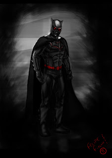
| Felipe Fialho's Bruce Wayne |
"Bruce Wayne's set out to create a character that inspired fear in the criminal underworld. Beause of this, the first thing that I changed was the mask, referencing Tengu masks, redesigned with samurai influences and red eyes to input fear. The suit was inspired by that worn in the earthquake saga and Batwoman's suit, mixed with the uniform of the Nolan movies, with the symbol embossed in red. The gadgets will be distributed by gloves, mask, cape, boots and in the belt."
Finally, I got a very cool email from a dad who told me that his son Connor, age 10, is a fan of
Superhero of the Month and wanted to contribute to this month's contest:
![]() |
| Connor's Batman |
Growing up, I was always drawing superheroes, Batman in particular, and thought that it was awesome that we have people as young as Connor checking out the site, getting inspired, and wanting to contribute. Thanks Connor for your contribution, and I hope you keep drawing and designing your own heroes, and new takes on the heroes you read about in comics and cartoons!
Update - 10/26
Gaz contacted me, wanting to submit in time for the deadline, but unable to due to Internet access problems. Although deadlines are fairly concrete, I'm not that much of a stickler, and am willing to work with anyone reasonably.
![]() |
| Gaz's Bruce Wayne |
Editor's Note: Gaz's thoughts on his piece are included in the image, so click it to go big!What do you all think? As usual, there are a lot of great redesigns sent in for the final post. Sound off in the comments,
review all of the Batman redesigns, and stay tuned for the winner and runners up! They'll be announced in one week's time!